
Sep 21, 2026
4 min read
🔌📈 How fast is Australia's electricity demand growing?
Good Monday evening and welcome to your climate data briefing. 🐝
This update includes:
- 1 x Analysis: Daily electricity demand in the NEM
- 2 x Quantish reads: Coal country and cryosphere chaos
- 7 x Data highlights: September fuel breakdowns from each state and territory
Let's go. 🛫
Analysis: Grid demand is rising to meet Australia's growing electricity needs
OnlyFacts has a new dataset tracking electricity demand.
It covers the National Electricity Market (NEM), which powers every state except WA and NT.
The data shows a clear trend: underlying electricity demand is rising.
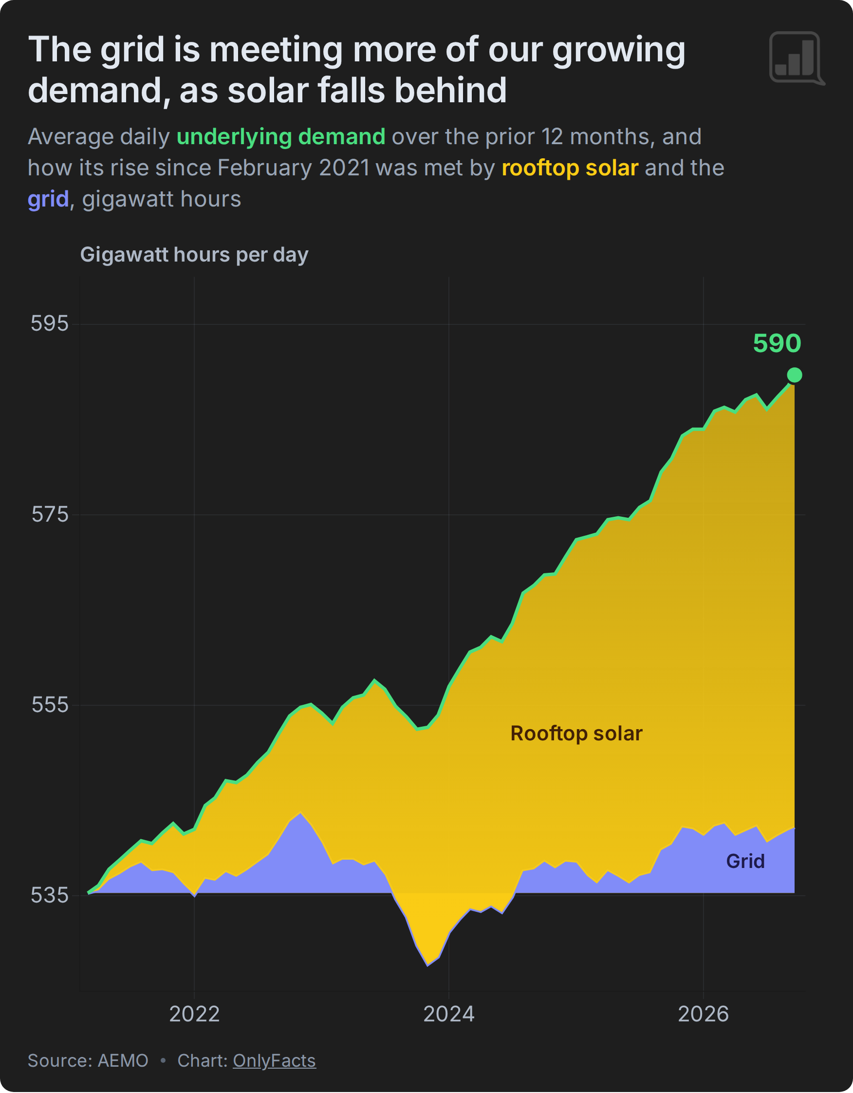
The daily average* is now roughly 590 GWh a day. That’s +10% higher than its 2021 low of 535 GWh and equivalent to average growth of about +1.8% a year.
(*12-month daily average calculated from the latest 365 days, smoothing out seasonal swings; One gigawatt-hour (GWh) is one million kilowatt-hours (kWh) - enough to power ~50,000 homes for a day.)
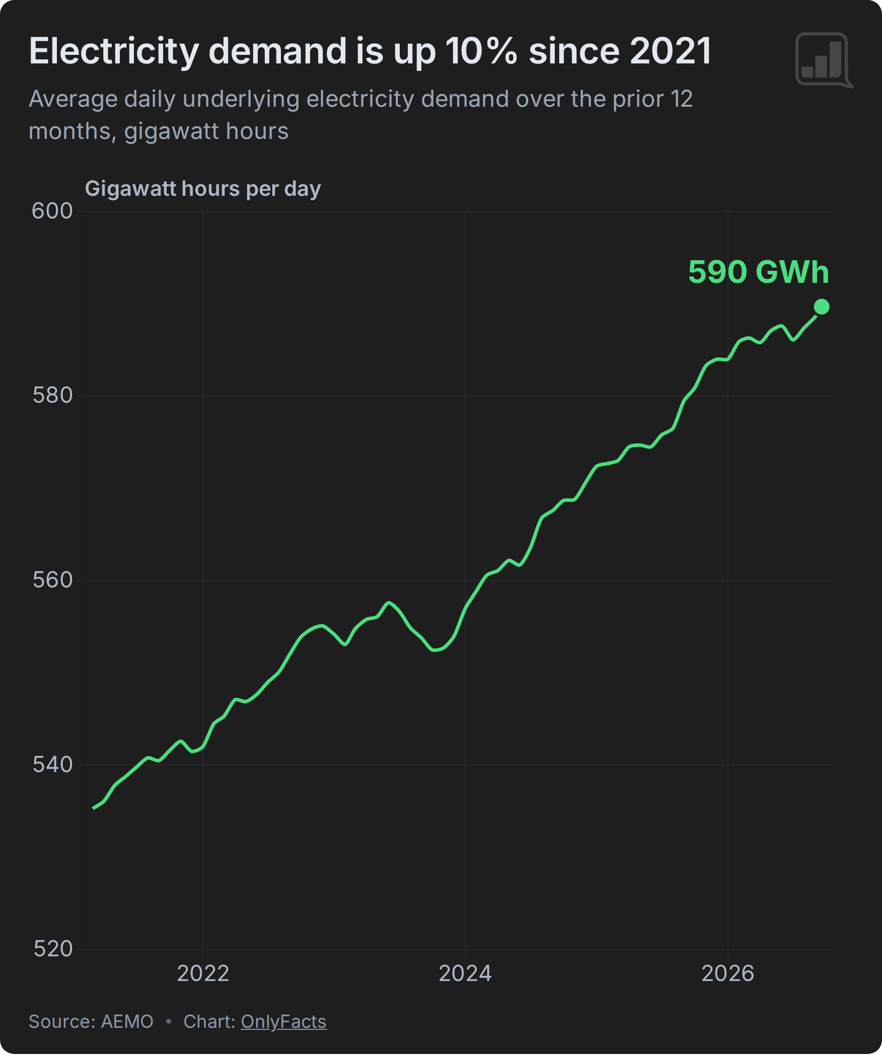
Demand dipped in late 2023 as a warm winter eased the need for heating.
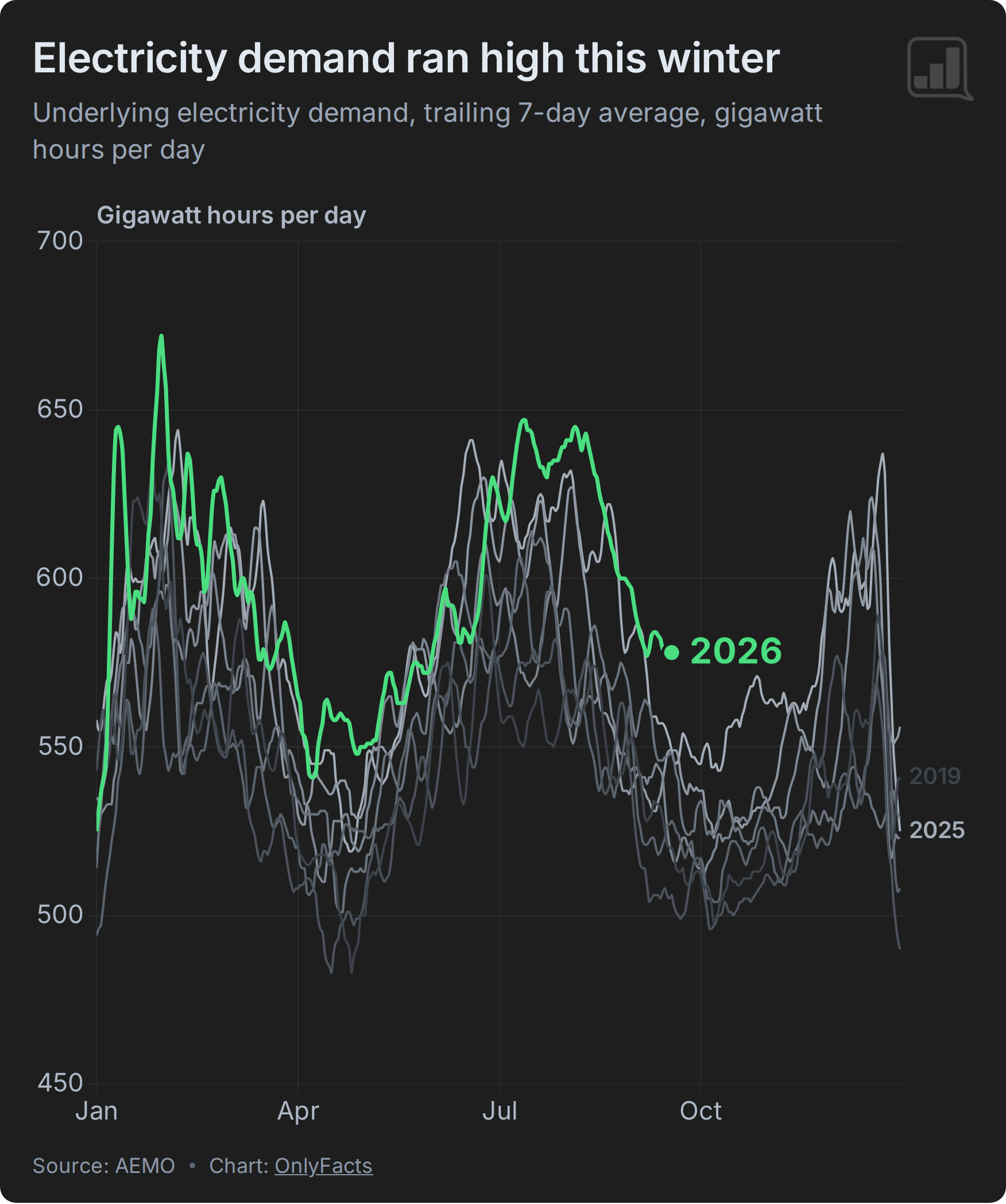
But this past winter was also exceptionally warm. Yet, it recorded the highest seasonal electricity demand in our dataset.
From June to August, demand averaged 619 GWh a day. That's +0.7% more than the previous winter — which was colder — and +10.5% more than winter 2019, the first winter in our dataset.
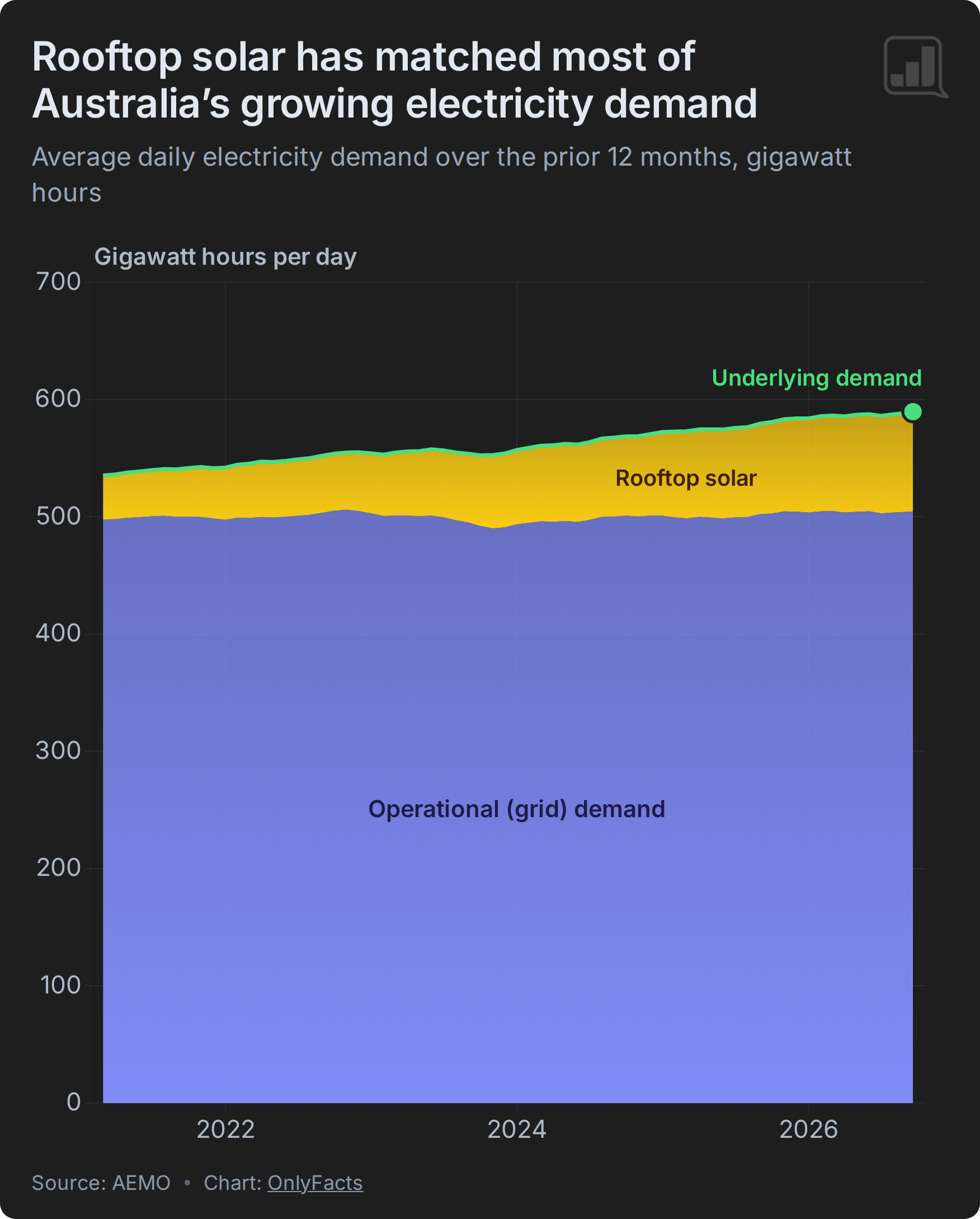
Underlying demand has two parts:
- The first is electricity supplied through the grid, known as operational demand.
- The second is rooftop solar generation from homes and businesses. This is estimated, not directly metered.
Together, the sum of operational demand and estimated rooftop solar generation give us the fullest picture of the amount of electricity we use.
The chart below stacks these components together, giving you a sense of scale.
Notice how the yellow wedge grows, showing rooftop solar has delivered much of the extra electricity we need.
In comparison, operational demand looks almost flat.
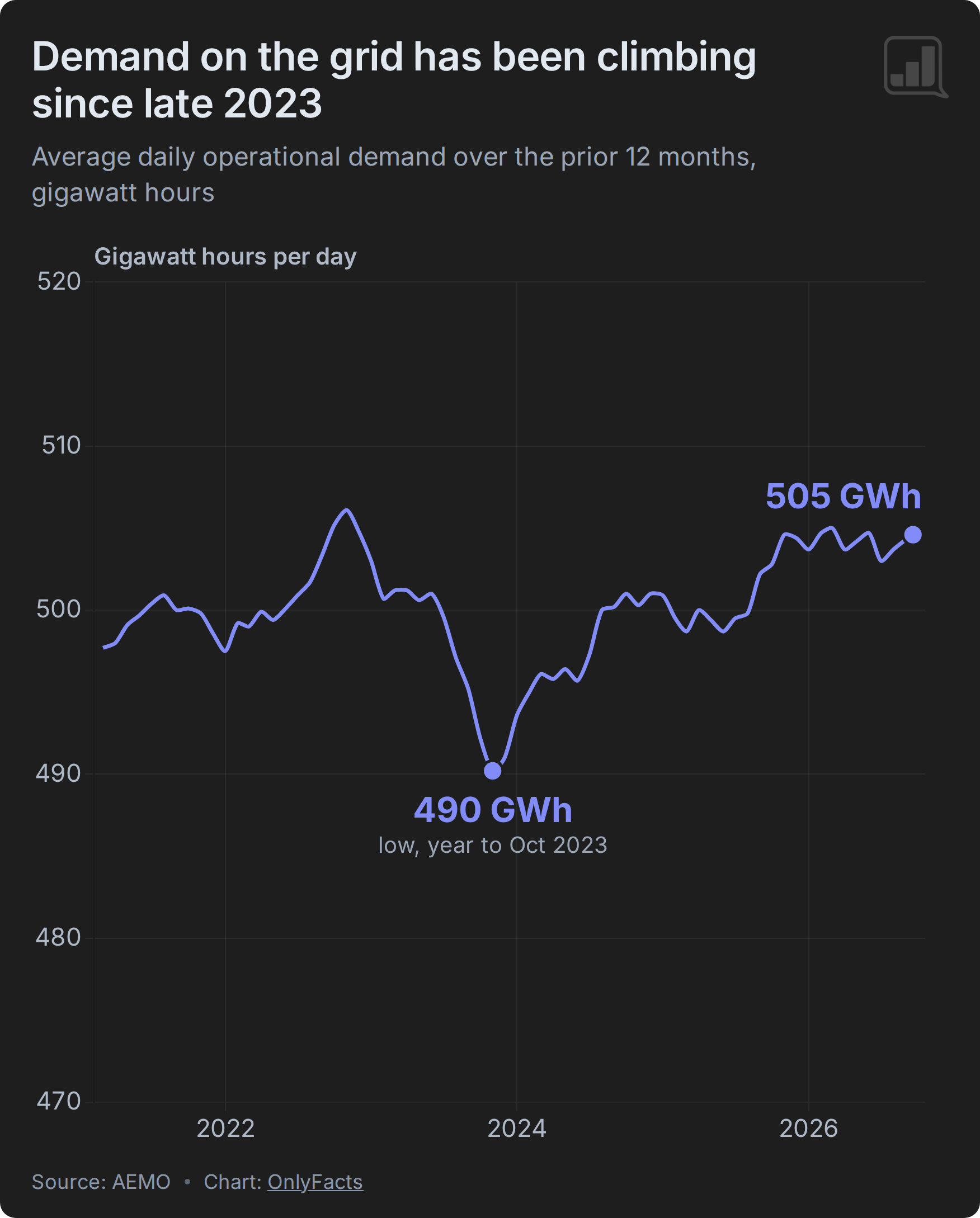
But when numbers are big, starting the y-axis at zero means we can't see smaller movements.
The chart below shows operational demand on its own.
It varies from year to year, but the direction since late 2023 is clear: operational demand has risen about +3%, from roughly 490 to 505 GWh a day.
When underlying demand grows faster than rooftop solar generation, the grid supplies the difference.
In 2023, the mild winter reduced underlying demand while rooftop solar kept growing. Grid demand fell.
But in 2024 and 2025, the pattern reversed. Underlying demand grew faster than rooftop solar generation, so grid demand rose.
What's driving Australia's growing demand?
AEMO points to three forces: electrification, population growth and data centres. Also, growth in rooftop solar generation has slowed.
We'll dig into each of these in the coming weeks.
For now, the takeaway is straightforward: Australia is using more electricity. Rooftop solar has met much of that additional demand, but the grid is being asked to supply more.
Quantish reads
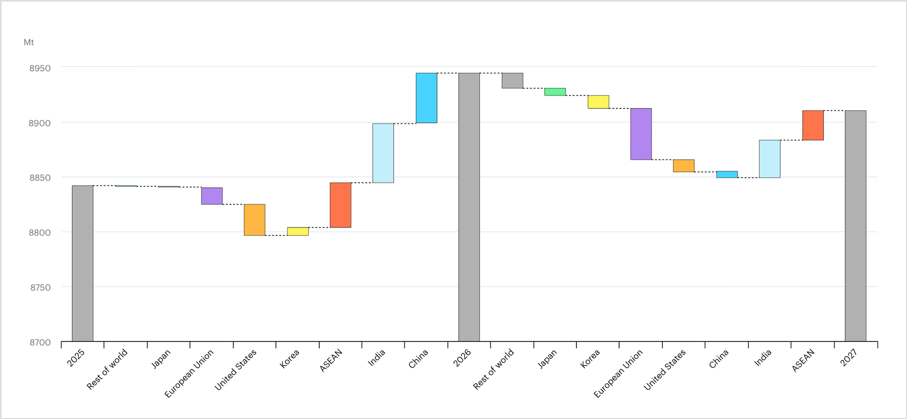
Global coal demand rose by 0.3% in 2025. It's a 'modest increase’ that suggests the market has stabilised after a growth spurt in the early 2020s. But a global average masks diverging regional trends. In China, demand remained unchanged. In India, Japan, Korea, and the EU, it fell. In the USA, coal demand rose by more than 9.5% — driven by electricity needs, high gas prices, and support from the current Administration. (IEA)
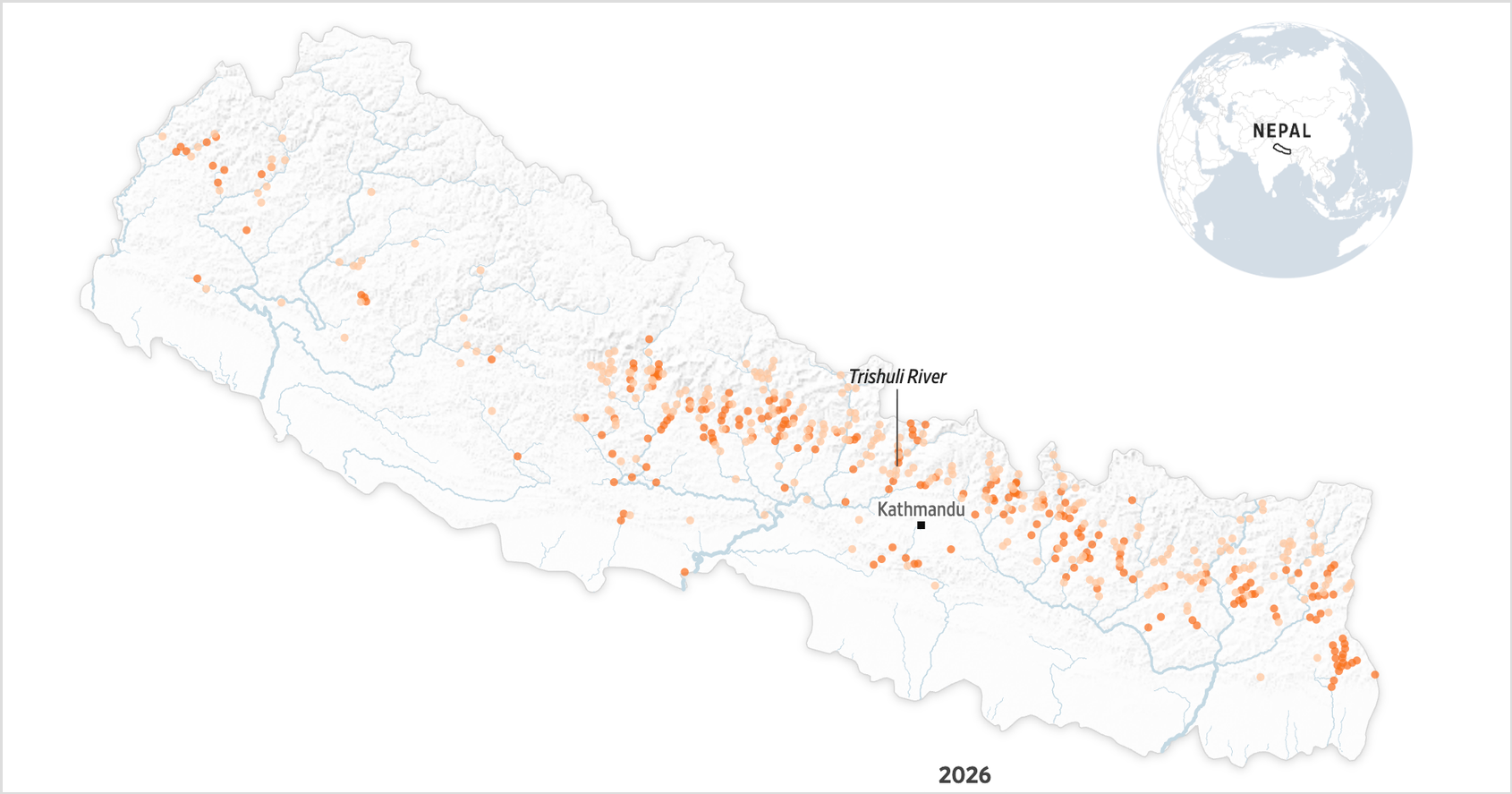
Nepal made a big bet on hydropower. The country has hundreds of projects in development, straddling rivers that crisscross the nation. Recently, the previously energy-starved nation was even exporting power. But while these projects were built to handle monsoon floods, the high-velocity debris flows seen last month 'are a different beast entirely'. 'The now-shattered Langtang Khola Hydro project was engineered to withstand a 100-year flood … The recent flood swelled to 20 times that level.' (Wall Street Journal)
Data updates
State and Territory fuel breakdowns
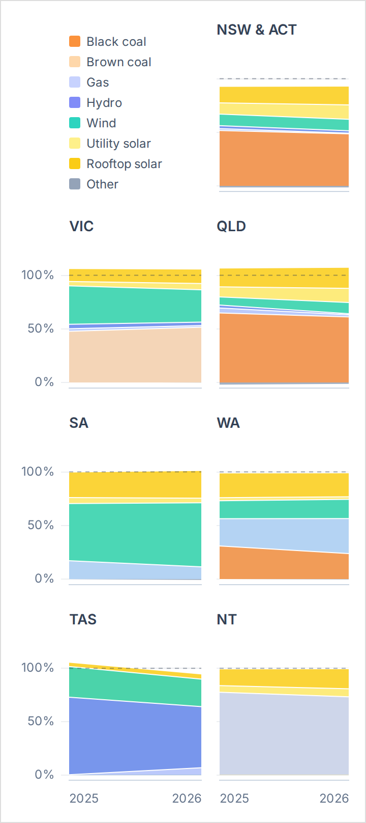
So far this month (versus September 2025)
💡 Highlights
- NSW/ACT: Black coal dropped to below half of demand at 48.6% (-3.1 points vs Sept 2025)
- VIC: Wind share fell to 30.2% (-5.6). Brown coal filled the gap at 51.6% (+3.8)
- QLD: Solar (rooftop + utility) provided one-third of demand at 32.9% (+5.9)
- SA: Wind reached 59.7% (+6.4). Gas fell to 11.4% (-5.7)
- WA: Gas and coal switched places as the largest source. Gas rose to 32.6% (+7.2), while coal fell to 23.8% (-7.1)
- TAS: Hydro fell to 57.4% (-15.4). Gas rose to 6.7% (+6.1)
- NT: Solar rose to 26.4% (+4.5). Gas fell to 73.2% (-4.4)
Grid of charts below show fuel mix in September 2025 and 2026. Data source: Open Electricity (Superpower Institute). Dashed line marks 100% of demand. Totals above or below reflect interstate flows.
Final Thought
'You don't need a Harvard degree, you just need a git.'
— Anish Acharya
That's your climate data briefing for this week. Wishing you a successful week ahead.
💛 Juliette and the OnlyFacts team
Need to make data easier to understand and harder to ignore?
